ShopDreamUp AI ArtDreamUp

Deviation Actions


![Tickling Sebastian's soles [B-day gift]](https://images-wixmp-ed30a86b8c4ca887773594c2.wixmp.com/f/64ce6539-2bee-43ff-8af7-5c7faa3e0d8c/dg2a1cs-0f3c50be-f405-4d81-bf3c-e7e73a6845e1.png/v1/crop/w_184,h_184,x_63,y_0,scl_0.20674157303371/tickling_sebastian_s_soles__b_day_gift__by_jolly_villevillage_dg2a1cs-92s-2x.png?token=eyJ0eXAiOiJKV1QiLCJhbGciOiJIUzI1NiJ9.eyJzdWIiOiJ1cm46YXBwOjdlMGQxODg5ODIyNjQzNzNhNWYwZDQxNWVhMGQyNmUwIiwiaXNzIjoidXJuOmFwcDo3ZTBkMTg4OTgyMjY0MzczYTVmMGQ0MTVlYTBkMjZlMCIsIm9iaiI6W1t7ImhlaWdodCI6Ijw9NTQwIiwicGF0aCI6IlwvZlwvNjRjZTY1MzktMmJlZS00M2ZmLThhZjctNWM3ZmFhM2UwZDhjXC9kZzJhMWNzLTBmM2M1MGJlLWY0MDUtNGQ4MS1iZjNjLWU3ZTczYTY4NDVlMS5wbmciLCJ3aWR0aCI6Ijw9MTI4MCJ9XV0sImF1ZCI6WyJ1cm46c2VydmljZTppbWFnZS5vcGVyYXRpb25zIl19.bSWPBzQ67W-X1a0CpvPIEZrvD43vZgwsCCup_uxI0Tg)
![Tickling Sebastian's soles [B-day gift]](https://images-wixmp-ed30a86b8c4ca887773594c2.wixmp.com/f/64ce6539-2bee-43ff-8af7-5c7faa3e0d8c/dg2a1cs-0f3c50be-f405-4d81-bf3c-e7e73a6845e1.png/v1/crop/w_92,h_92,x_32,y_0,scl_0.10337078651685/tickling_sebastian_s_soles__b_day_gift__by_jolly_villevillage_dg2a1cs-92s.png?token=eyJ0eXAiOiJKV1QiLCJhbGciOiJIUzI1NiJ9.eyJzdWIiOiJ1cm46YXBwOjdlMGQxODg5ODIyNjQzNzNhNWYwZDQxNWVhMGQyNmUwIiwiaXNzIjoidXJuOmFwcDo3ZTBkMTg4OTgyMjY0MzczYTVmMGQ0MTVlYTBkMjZlMCIsIm9iaiI6W1t7ImhlaWdodCI6Ijw9NTQwIiwicGF0aCI6IlwvZlwvNjRjZTY1MzktMmJlZS00M2ZmLThhZjctNWM3ZmFhM2UwZDhjXC9kZzJhMWNzLTBmM2M1MGJlLWY0MDUtNGQ4MS1iZjNjLWU3ZTczYTY4NDVlMS5wbmciLCJ3aWR0aCI6Ijw9MTI4MCJ9XV0sImF1ZCI6WyJ1cm46c2VydmljZTppbWFnZS5vcGVyYXRpb25zIl19.bSWPBzQ67W-X1a0CpvPIEZrvD43vZgwsCCup_uxI0Tg)


Description
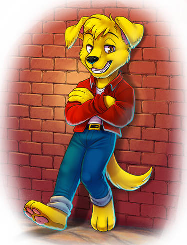
In animation, there are 12 principles, one of which is solid drawing. Solid drawing refers to excellent draftsmanship in your drawings. This is a scrapped drawing from the animation I'm working on for my Advanced 2D Animation class this quarter. It was only scrapped because it doesn't fit into the stumble sequence. The arms and legs are wrong, meaning, the drawings before and after it are the opposite side. Be that as it may, this tween is a great example of solid drawing. The proportion, anatomy, expression, weight and opposing action are all very clear and well drawn. It's important to spend as much time as possible making sure your every drawing in an animation is as good as it can be and this is a great example of what that should be.
This was done with pencil on animation paper, on a 12 field.
ALL MATERIALS, CONCEPTS & CHARACTERS COPYRIGHT 2010-2014 MATT STEVANUS
ALL RIGHTS RESERVED
This was done with pencil on animation paper, on a 12 field.
ALL MATERIALS, CONCEPTS & CHARACTERS COPYRIGHT 2010-2014 MATT STEVANUS
ALL RIGHTS RESERVED
Image size
3488x2424px 11.41 MB
Comments4
Join the community to add your comment. Already a deviant? Log In
Yeah... I won't pretend I'm the reigning god-emperor of humility, but touting your own work as the ideal of how a drawing should look is a little presumptuous. It'd be fine if you just said that this is well-drawn for your work, or if you used a drawing from folks like Milt Kahl or Frank and Ollie as a teaching tool, but calling this a great example of solid drawing... ehh... From what I can see, the thumb on the left hand is just a stump and doesn't have joints like the one on the right, and the far edge of the jacket doesn't run parallel to its companion on the other side, giving the illusion that one side of the jacket is longer than the other. Also, he's pulling his lower lip into his open mouth for some reason, the eyes don't sit in the same plane on the face, and the close eye is smaller than the far eye when it should be the other way around in a 3/4 view. I also noticed that the top edge of the hat isn't as curved as the bottom (making it look flat) and the jacket hood just disappears on the other side of the neck. Really, a lot of these issues would be solved with more drawing through (a good example of that: cartoonsnap.com/blogspot/sherm… It'd help to picture the top hat as a cylinder, I think). That's my critique. Not saying it's terrible, just maybe not as stellar as the artist's comment built it up to be.